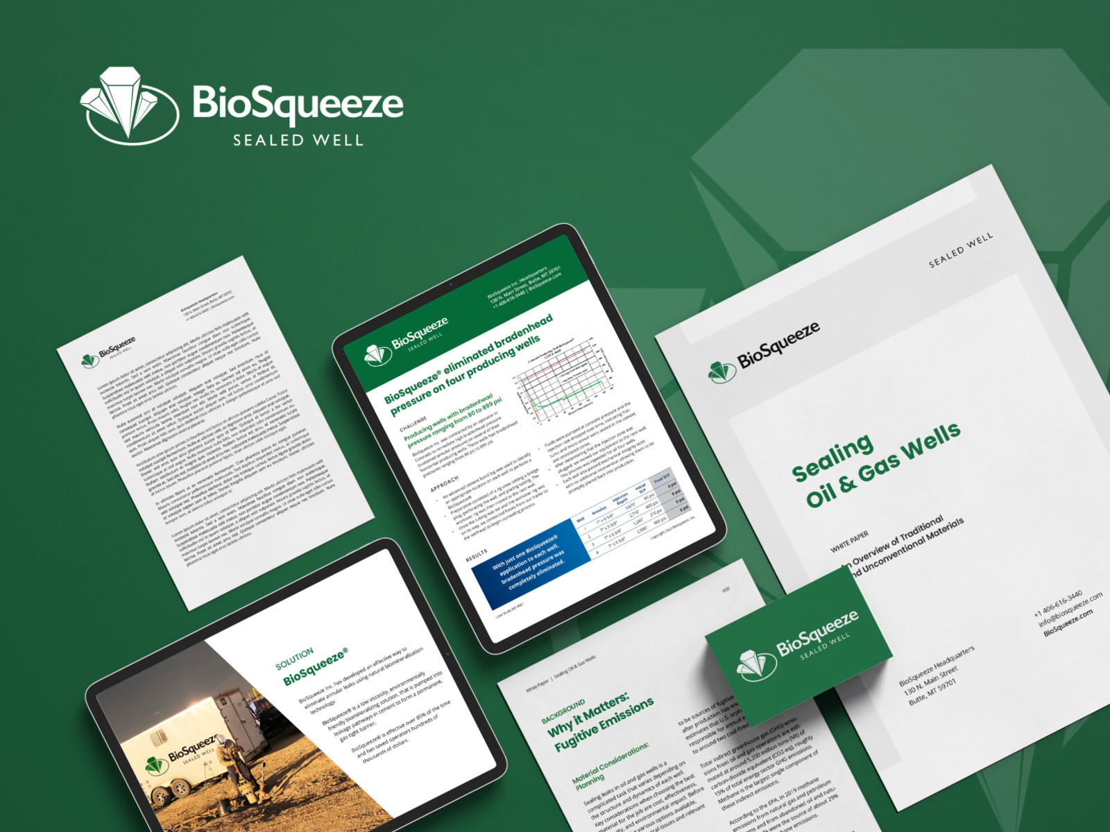
A strategic rebrand positioned BioSqueeze as a cutting-edge leader in environmentally responsible well sealing—securing funding, clarity, and market recognition.
BioSqueeze
Creative Director Norrie Syme
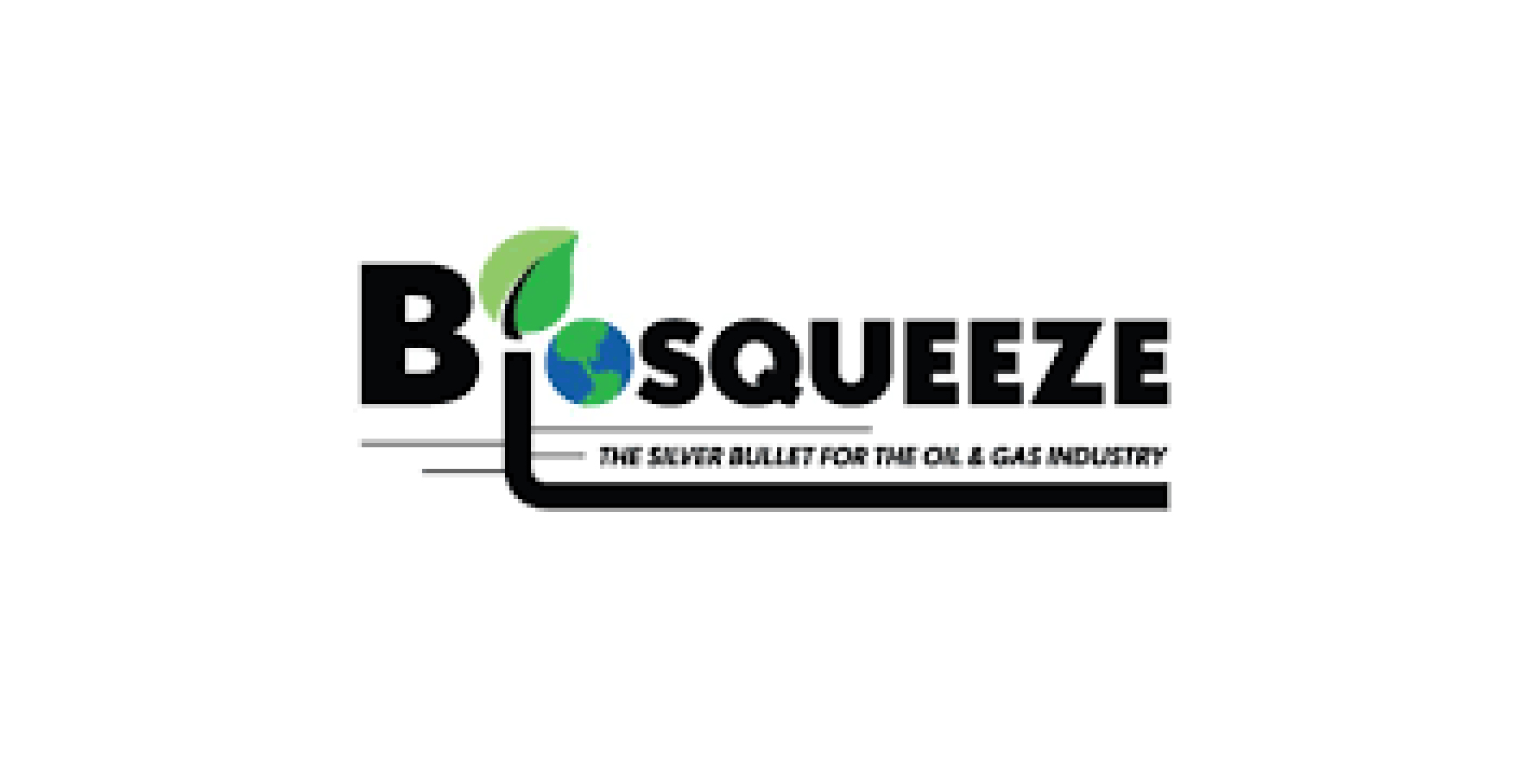
BioSqueeze Inc., a pioneer in biomineralization technology, required a brand identity that matched its mission: eliminating methane leaks and improving well integrity in the oil and gas industry. The original logo—developed without strategic grounding—lacked the sophistication and clarity to reflect the company’s scientific expertise and environmentally responsible innovation.
Original
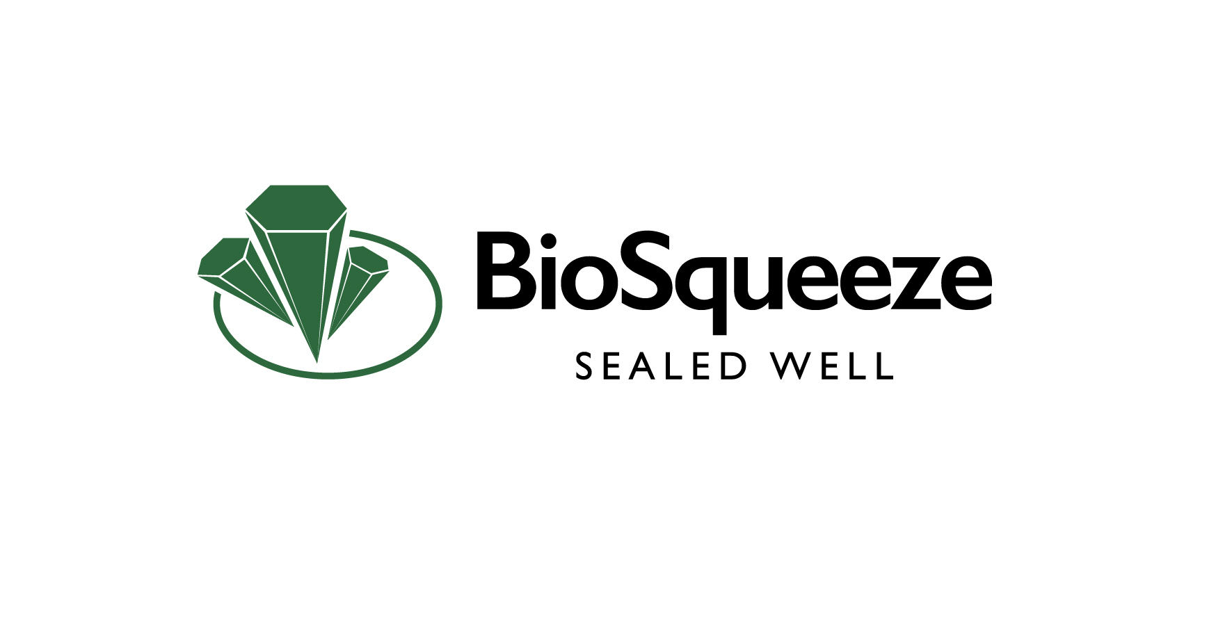
Evolved
A comprehensive brand strategy session, led by a marketing partner, helped articulate a clearer vision and set of values, guiding the creation of a focused brand narrative and compelling tagline.
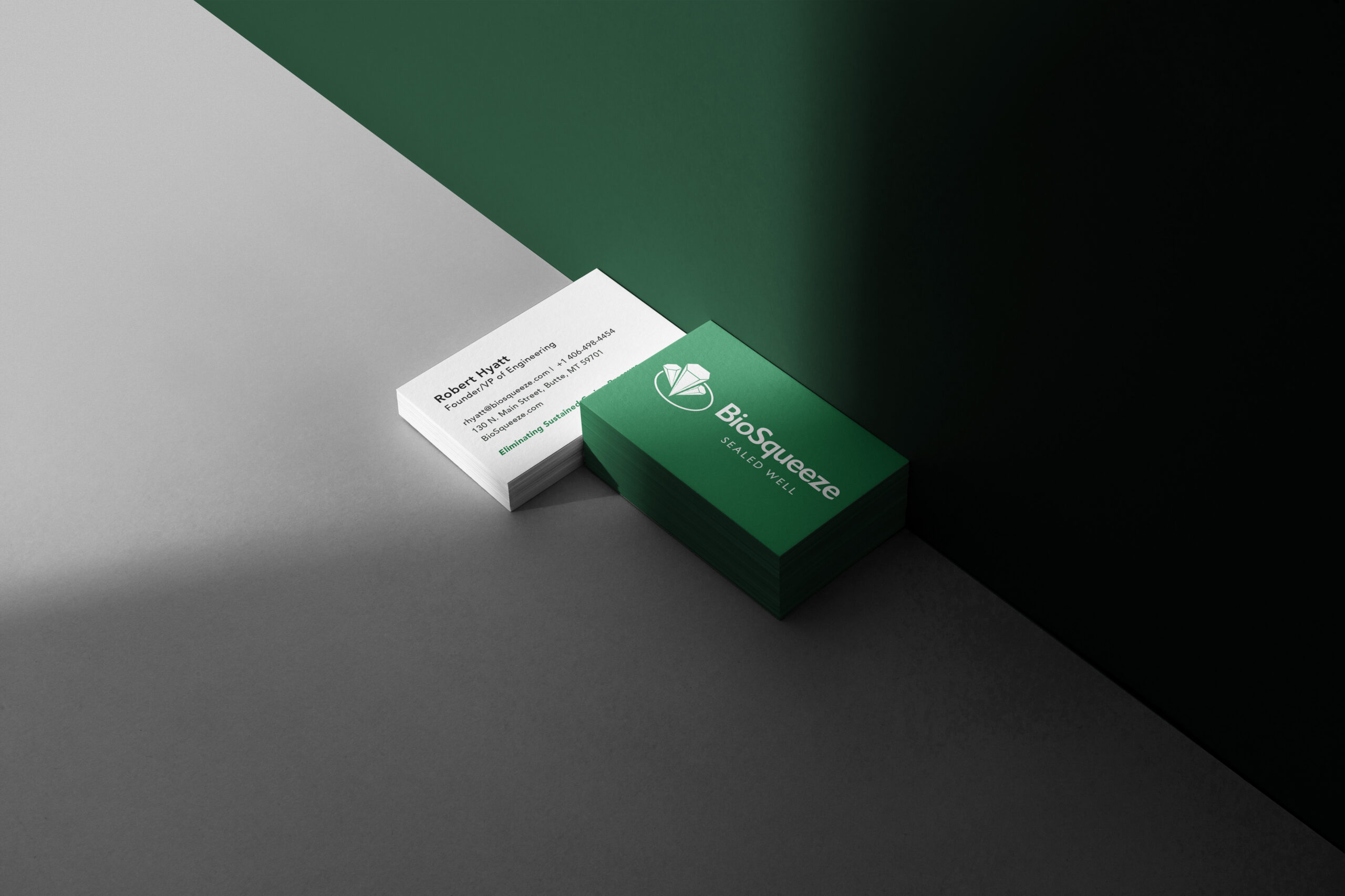
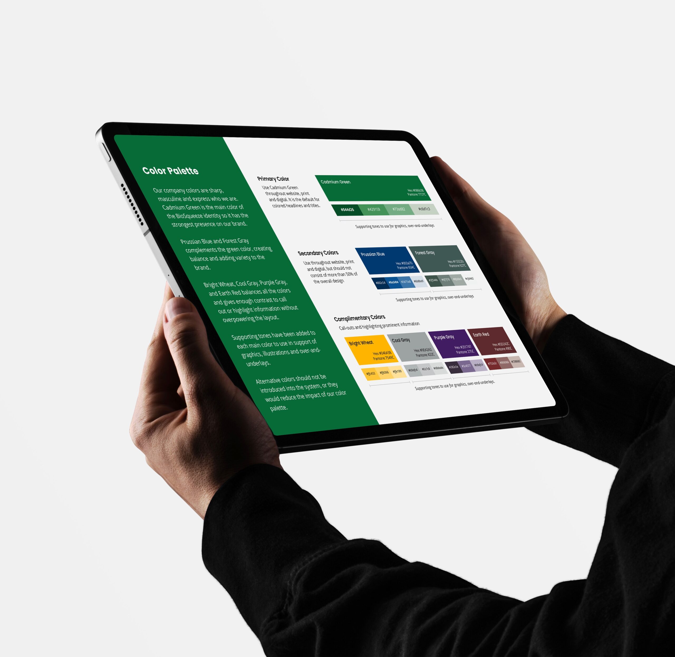
This strategic foundation informed a complete visual identity overhaul, including an expanded color palette, modern type systems, refined imagery, and a flexible graphic system built for consistency across platforms.
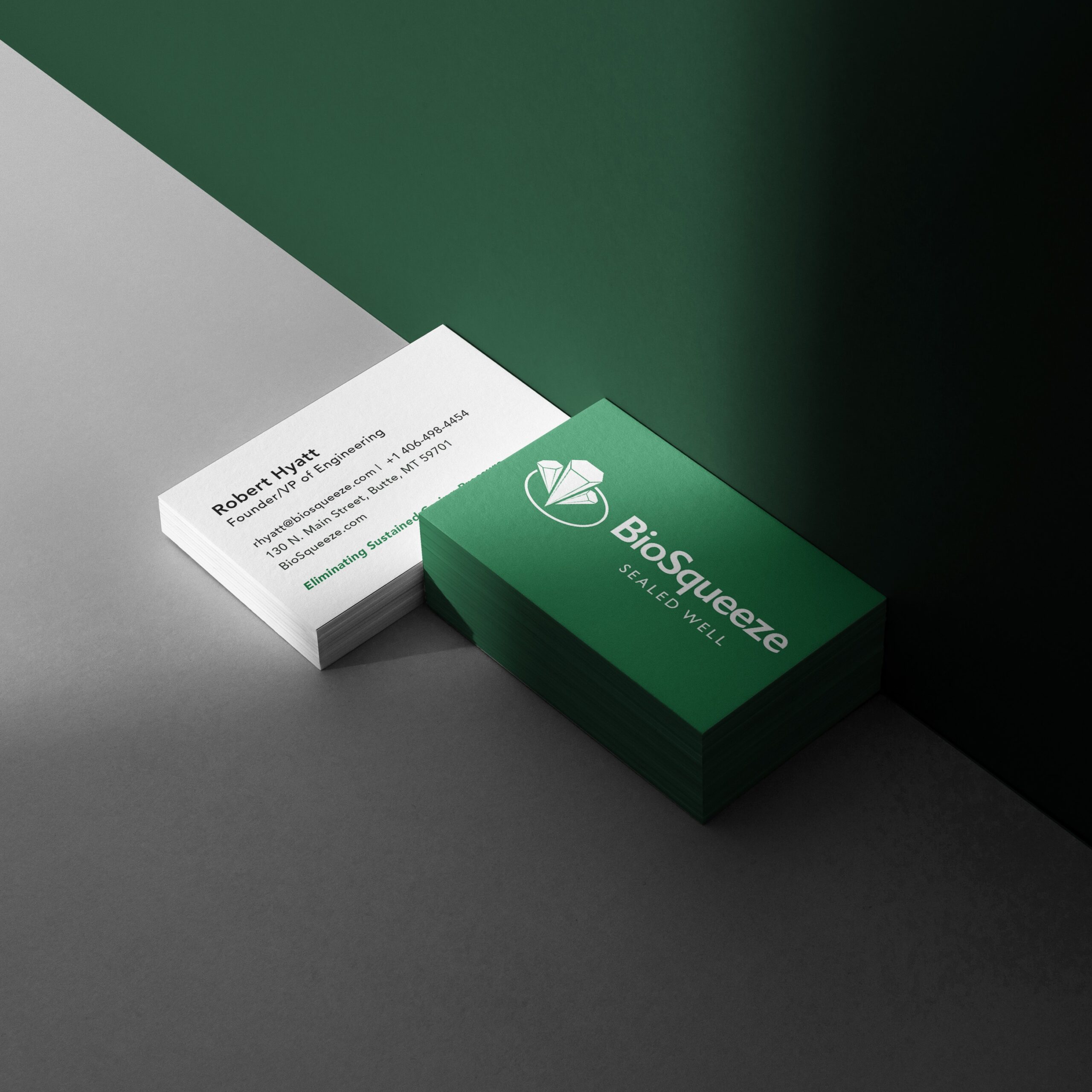
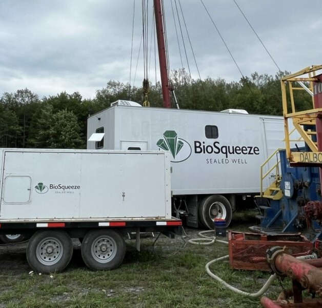
At the center of the new identity is the redesigned logo, inspired by the hexagonal crystal formations intrinsic to the company’s biomineralization process. The symbol—featured in the "Sealed Well" mark—embodies sealing precision, environmental stewardship, and technical excellence. Its sleek, geometric design ensures adaptability across digital, print, and environmental applications.
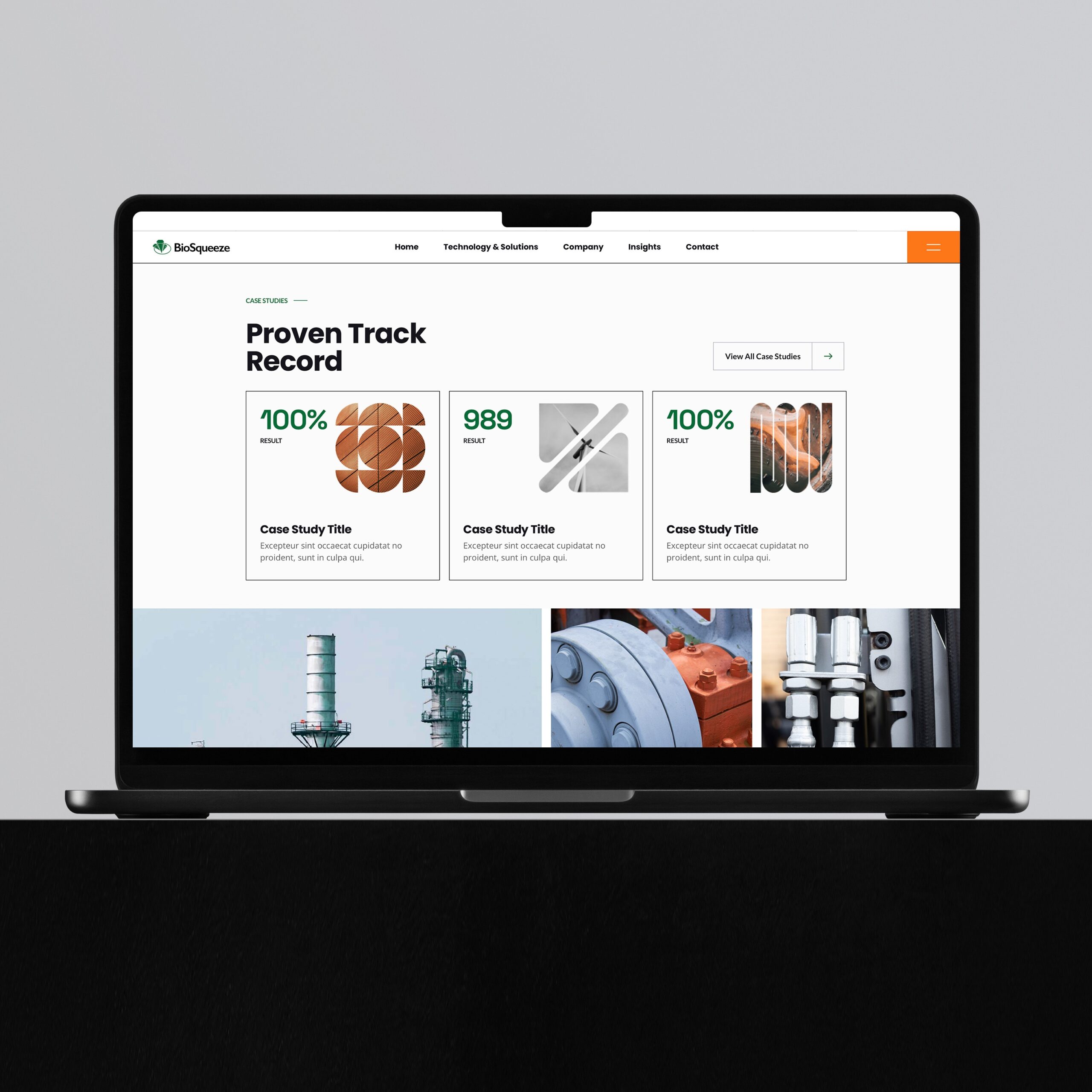
The rebrand was executed across digital platforms, collateral, and communications, culminating in a detailed brand book that supports consistent rollout and scalability. The revitalized identity not only elevated BioSqueeze’s visual presence but also helped reinforce its leadership in the energy sector.
Since launch, BioSqueeze has strengthened its market position and secured major funding, further enabling its growth and impact within the industry.