Distinct sub-brand identities, custom merchandise, and a dynamic digital campaign positioned Prime as a unified yet multifaceted leader in performance training and physiotherapy.
Prime Therapies
Creative Director Norrie Syme
To support growth and service clarity, distinct visual identities were developed for Prime’s two core offerings: Performance (strength and conditioning) and Physio (physical therapy and rehabilitation). The initiative included full rebranding, a multi-channel marketing strategy, custom product development, and motion-driven content to drive engagement and elevate the brand.
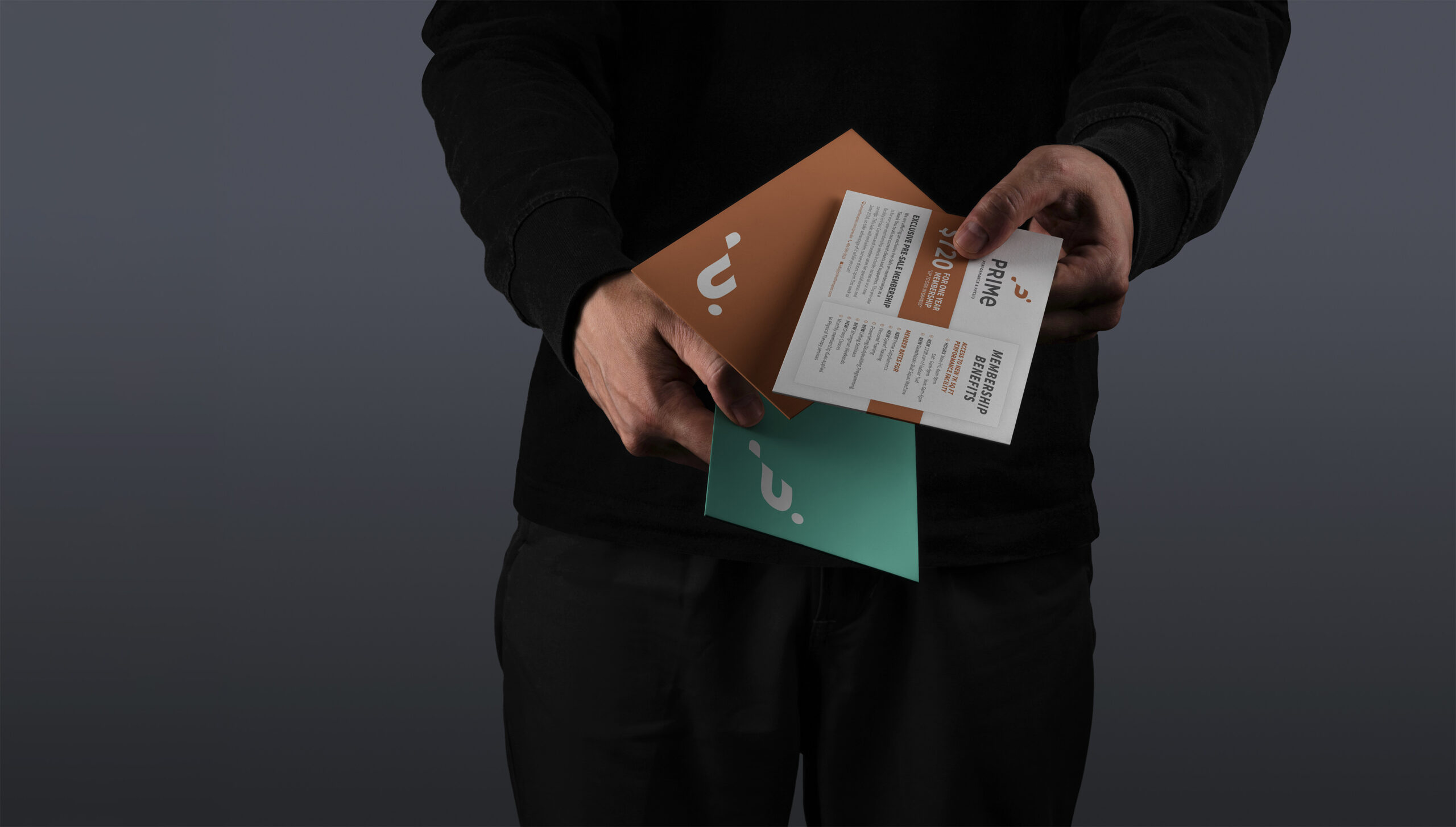
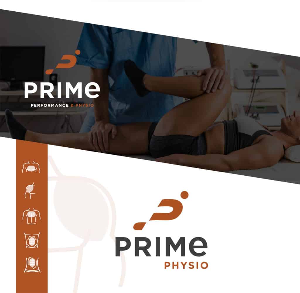
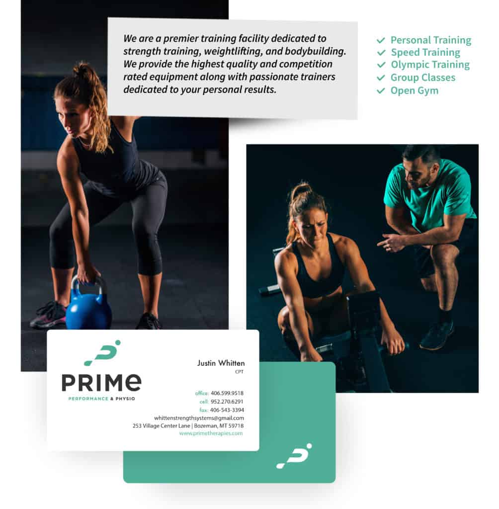
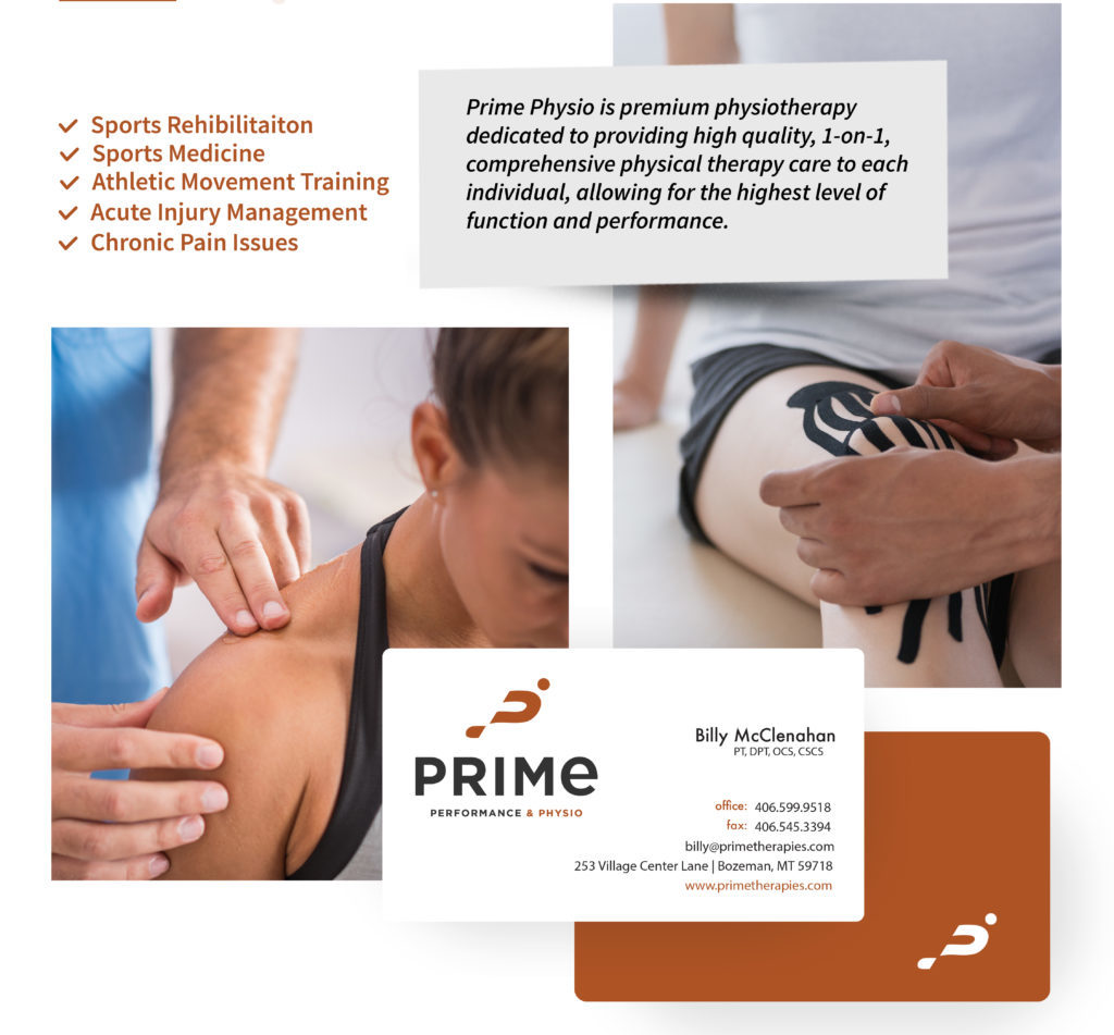
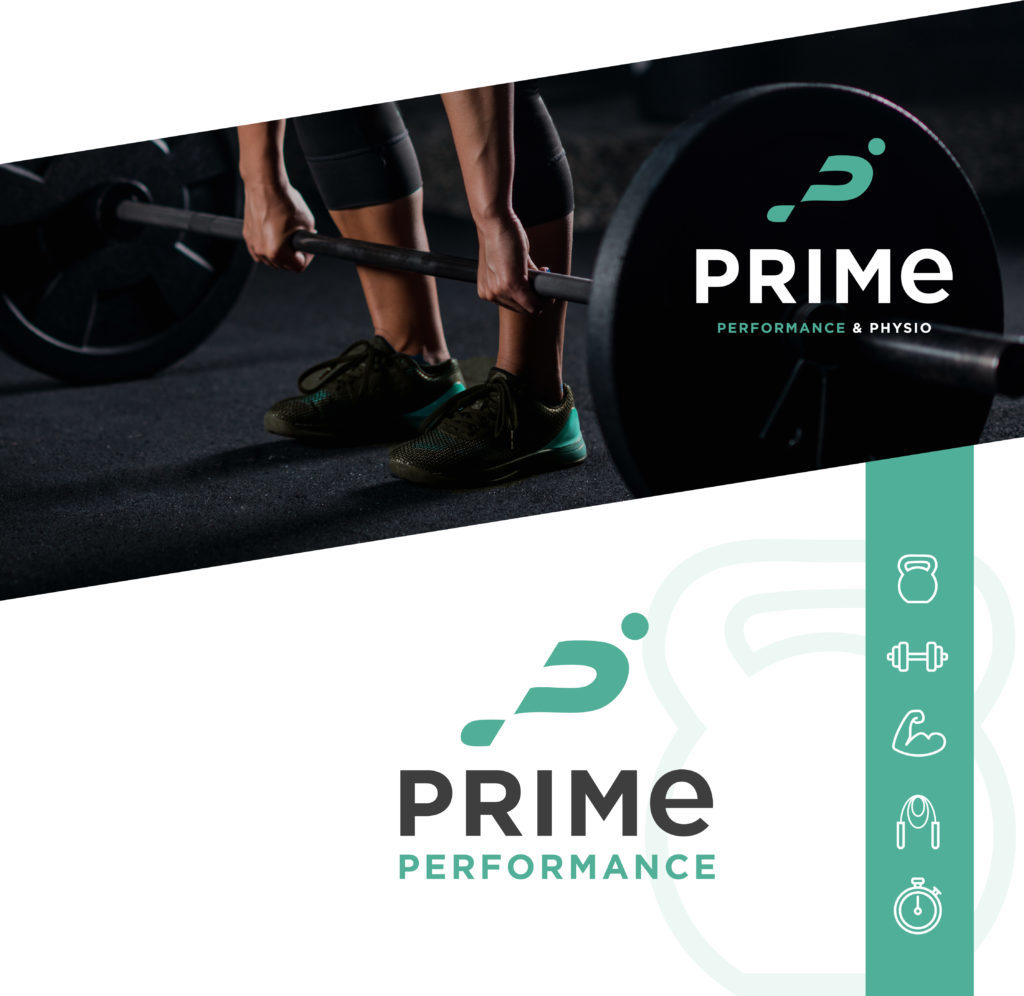
Under the Prime umbrella, two differentiated sub-brands were created—each with its own logo, color palette, and iconography—while retaining shared typography and structural consistency to preserve brand unity.
Teal, symbolizing energy and movement, was chosen for Prime Performance, while rust, evoking warmth and healing, defined the look and feel of Prime Physio.
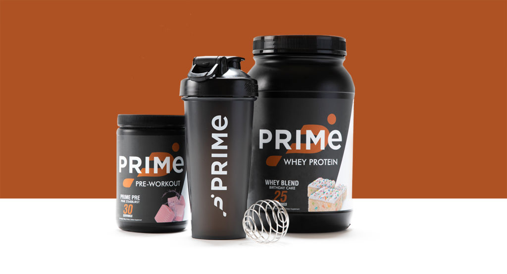
A custom product line was introduced, featuring branded protein powders, workout supplements, shaker bottles, and gym apparel.
This not only created a new revenue stream but also extended Prime’s value proposition beyond its physical locations, reinforcing its commitment to holistic wellness.
The brand launch was supported by a comprehensive campaign that spanned print, digital, and social platforms. Deliverables included event flyers, promotional posters, social media graphics, and motion content for the grand opening of Prime’s custom-built gym. Video content and animations were used to highlight core services, build excitement, and drive online engagement.